Disabled people
Nearly 15% of the world’s population experiences some form of disability – yet historically, the portrayal of people with disabilities in marketing has rendered them all but invisible. Nothing about us without us expresses the conviction that people with disabilities must always be included from the beginning of any planning process and should never simply be an after-thought. In keeping with this conviction, the insights that follow were built with input from community partners and may be used as a starting point to help create marketing that positively and authentically represents people with disabilities – including, but more importantly, beyond key moments like Disability Employment Awareness Month campaigns. Every Disabled person has a right to experience the creative put out in the world. In partnership with Disability:IN, LaVant Consulting and others, we’re thrilled to share our accessible marketing playbook.
Developed in partnership with Disability:IN and Lavant consulting

- Marketing’s responsibility
- Definitions of disability
- Disability diversity
- Assistive technology
- Word choice and appropriate language
- Three principles to accessibility
- Web accessibility
- Video and audio
- Social media
- Communications
- Event design
- Partner closely
- Self-representation
- Everyday portrayal
- Reflect intersectionality
- Subvert stereotypes
- Case studies
Marketing’s Responsibility
What is disability-inclusive marketing and why is it important?
Disability-inclusive marketing is built on the premise that marketing should represent and be accessible to all people with or without disabilities. Not only is including people with disabilities the right thing to do, but it also makes marketing more authentic. Around the world, over 1 billion people live with some form of disability. In the U.S., 20.3 million families have at least one member with a disability and one in four adults live with a disability. Ultimately, most people will live with some form of disability in their life. Furthermore, in the U.S., the total disposable income for working-age people with disabilities is about $490 billion. This is similar to other significant market segments such as Black and Hispanic Americans. This market size doubles when considering family members, caregivers, and others (American Institute of Research). Authentic marketing can do more to represent the wide range of abilities and neurodiversity in the world around us.
Remember
Supporting people with disabilities is a 12-month commitment. The anniversary month of the Americans with Disabilities Act and Disability Employment Awareness Month are celebrated annually in July and October. However, showing up just for July and October can come across as opportunistic and empty. Showing meaningful representation outside of these two months demonstrates a deeper commitment to inclusion.
Definitions of Disability
There is no single way to define disability – it’s an umbrella term with different meanings across different people. One thing is certain: the world is filled with people who have a range of apparent and non-apparent disabilities. The ADA defines a person with a disability as someone who has “a physical or mental impairment that substantially limits one or more major life activities, a person who has a history or record of such an impairment, or a person who is perceived by others as having such an impairment.” Yet many people don’t define themselves by or feel limited because of their disability — instead view disability as a strength.
Disability diversity
Disability itself is incredibly diverse
There are many ways to describe and categorize levels of ability. Disabilities are not always apparent. One U.S. study found that among people with disabilities, 74% don’t use anything that could visually signal their disability. Non-apparent disabilities can often limit daily activities, range from mild challenges to severe limitations, and vary from person to person. Disability is often broken into several broad classifications. Here are just a few examples:
- Blind or low-vision
- Chronic health condition (e.g., diabetes)
- Deaf or Hard-of-Hearing
- Learning (e.g., dyslexia)
- Neurodiversity (e.g., on the autism spectrum)
- Physical (e.g., spinal cord injury)
- Psychiatric (e.g., depression)
- Speech
Assistive Technology
Consider the different ways disabled people may be accessing your content.
Assistive technology is “any item, piece of equipment, software program, or product system that is used to increase, maintain, or improve the functional capabilities of persons with disabilities.” Source: ATIA
This includes high-end technologies like specialized digital devices, such as refreshable braille displays or screen readers, hardware, such as prosthetic limbs, or no-tech solutions like paper flashcards, large print, canes or walkers.
If marketing content or campaigns aren’t created with accessibility in mind from the beginning, they may be incompatible with assistive technologies, preventing people from interacting with your brand.
Consider these important points about assistive technology:
- Not everyone uses assistive technology or identifies as being a user of assistive technology, either due to lack of funds, awareness, know-how, or preference.
- Disabled people may not use assistive technology in the way that it was designed for.
- There’s a wide range of assistive technology and there isn’t a 1:1 mapping of technology to disability. For example, people with cognitive disabilities can also benefit from using a screen reader, originally designed for people who are blind or have low vision.
While not an exhaustive list, these are some of the most commonly used assistive technologies to consider when creating accessible marketing content.
- Screen reader: A screen reader is an assistive technology, primarily used by people who are blind or have low vision. It converts text, buttons, images, and other screen elements into speech or braille.
- Captions: Captions are the visual display of the audio component of video programming, allowing people to read spoken dialogue, and non-speech information, like music or sound effects.
- Keyboard navigation: Keyboard navigation allows people who are unable to use a mouse to navigate content by using key functions on their keyboards such as various commands, and the arrow keys. Screen reader users commonly use keyboard navigation.
- Voice control: Voice control functions enable people to convert speech into text on the screen, and also map voice commands to mouse and keyboard actions, making it easier to accomplish various tasks.
- Color modification: Color modification allows people to change colors to a more suitable display. This includes high contrast versions, or inverted color settings that may allow for better readability- such as a black background with bright text and links.
Word choice and appropriate language
Be thoughtful about word choice, but don’t let it derail the story
Consider using language that is both inclusive and empowering. There is no common language about how to address disability.
Some people advocate for the use of people-first language (e.g., people with disabilities), while others push for identity-first language (e.g., disabled people). This decision is related to the individual’s own relationship with their disability and their disability journey. Work closely with individuals by asking and using their preferences. It is important to acknowledge that disabled people are more than their disability. While language is important, don’t let it be so intimidating that you avoid the conversation altogether.
A few key considerations to help you select appropriate language:
- Avoid generalized statements: Acknowledge people as individuals where possible and when speaking about groups, use words like “some” and “may.” Be mindful of when and how you use the word “community,” to avoid grouping all disabled people into one box.
- Avoid othering phrases: Avoid phrases that create an “us vs them” mentality. For example, avoid referring to people without disabilities as “normal users.”
- Empower, don’t glorify: Be humble when talking about disability solutions, and avoid ‘miracle’ storytelling. Avoid ‘inspiration porn’ e.g. celebrating disabled people for achievements that would be considered ordinary if the person didn’t have a disability.
Resource
For more language insights, explore resources like this writing guide and terminology guide.
Three principles to accessibility
Ensure representation and adopt a growth mindset in teams
1.“Nothing about us, without us”
- Include disabled people from the beginning: People with disabilities should be included from the start of any planning process and never as an afterthought.
- Understanding the needs of disabled people: People with disabilities have been historically and systematically underrepresented in decision-making that has a real and direct impact on their lives. Involving disabled people can help you understand and reflect their needs and prioritize diverse perspectives in your work.
2. Consider accessibility a mindset, not a box to check
- A constantly evolving process: Accessibility best practices change as technology develops and is dependent on the evolving and varied needs of people with disabilities. Keeping up with this requires teams to embed accessibility at every turn of their work— accessibility should be a program, not a project.
- Accessibility beyond compliance: In order to make marketing truly accessible, we need to go beyond the minimum of box-checking for compliance purposes. Accessibility as legal compliance should be the floor, not the ceiling.
- Relevant across content: Accessibility should be a standard for all content, not just disability-specific content.
3. Start somewhere and build on what you learn
- An ongoing journey: Achieving any accessible marketing goals is a continual process. Even with progress, we must acknowledge there is a long way to go.
- Small changes can have a big impact: If you’re new to accessible marketing, you can easily become overwhelmed by the many best practices, or time and budget implications. Remember that even seemingly minor adjustments can have a major impact.
- Start somewhere and ask for help: When team members are ready to learn, we can all grow together.
Web accessibility
Accessibility efforts should show up throughout the entire project
From information gathering, briefing, content strategy, and production to design and engineering, accessibility should be considered.
Project setup:
- Set accessibility goals in the creative brief
- Communicate the importance of accessibility to all stakeholders
- Build a minimum of 2+ weeks into your timeline for accessibility reviews and testing
Design and engineering:
- Understand accessible design and development principles
- Develop with Web Content Accessibility Guidelines in mind
Testing and launch:
- Conduct an accessibility audit on your site
- Manually test your site using Web Content Accessibility Guidelines and assistive technologies
- Consider usability testing with disabled people prior to launch
Web accessibility is critical to making the internet accessible for all
Here are some key guidelines to consider when creating web experiences.
- Consider the limitations of overlays: Web overlay widgets are a popular way to attempt to improve website accessibility automatically. While these add-ons try to improve certain features, they do not address the root issues necessary to reach full compliance and may even interfere with the website’s proper functioning.
- Check that the layout is linear and logical: Implement semantic and logically structured HTML. Section heading levels should be defined in a hierarchical manner. This layout should remain clear even when the screen is zoomed in.
- Check that the website is fully accessible via keyboard-only navigation and via screen reader: Identify the best keyboard order for interactive elements and include focus states in the design.
- Ensure all text is legible with color and font considerations: Ensure the contrast ratio of all colors used on your site exceeds 4.5:1. This is the difference in brightness between two colors. Ratios range from 1:1 (white text on a white background) to 21:1 (black text on a white background). To check contrast, you can use this contrast checker. For fonts, consider what you are using for large text such as headlines, and smaller text which should have improved readability, avoiding the use of all caps.
- Avoid using only color or only sound to convey key information: Ensure disabled people can understand the content even if one or more senses are limited. For example, do not use red text as the only way to indicate a required field or an audio cue as the only indication of an action. Consider adding patterns, shapes, location or other methods of conveying information.
- Ensure adequate touch size for interactive content: The touch target of interactive elements must be large enough to tap comfortably with one finger. Touch targets should be at least 48x48 CSS px.
- Avoid flashing content and long animations that cannot be paused: Animations that last longer than five seconds should allow people to pause, stop, or hide it. Media with strong visual patterns including strobing, flickering, blinking, or flashing can make it extremely difficult for people with cognitive or learning disabilities to focus on content— and in some cases induce seizures.
- Ensure hyperlinked text provides context so people know what to expect when the link is opened: While screen readers can read a full page to a person, they may prefer to listen to a list of links. Links should be as descriptive as possible without their context. For example: ‘Post-survey’ or ‘XYZ article’ instead of ‘click here.’
- Include labels or alternative text for all buttons and non-decorative images: Alt text is a custom description added to any image, graph, or chart. It describes what’s depicted in the image. People using screen readers will be able to hear this description. This should be added to any image, graph, or chart describing what’s depicted in the image. It allows people using screen readers to understand the image, and also proves helpful when an image doesn’t load properly. Images that are purely decorative should have an empty alt tag (alt="").
Example
Check out the accessible design decisions made on Google’s Belonging site
Video and Audio
It’s best to not convey information solely through audio or visual means
Video is a format that can be inaccessible to many if left without additional considerations. When creating videos and audio, it’s important to remember that not everyone will be able to hear or see your video content. This is also true for audio-only content, where a transcript should be available.
Custom captions can help everyone understand audio
Captions are text descriptions of all audio in a film or video, allowing these aspects to be accessed visually, helping not only deaf or hard-of-hearing people, but anyone watching videos in a noisy environment, quiet space, or without headphones.
They include dialogue, music, background noises, and differentiation between speakers. Captions should be part of the creative process for all videos– not just a last-minute add-on.
Consider the following tips when creating captions:
- Don’t only rely on auto-generated captions: Automatic captions are generated by machine learning algorithms, so the quality of the captions may vary. While Google is constantly improving its speech recognition technology, we encourage creators to add human-generated captions first. Automatic captions may misrepresent the spoken content due to mispronunciations, accents, dialects, or background noise. You should always review automatic captions and edit any parts that haven’t been properly transcribed.
- Decide on open or closed captions: Open captions are embedded and cannot be turned off, whereas closed captions can be turned on and off by the viewer.
- Consider how best to describe what’s happening on-screen: For more guidance consult further guidance on creating captions from the University of Washington on accessible videos and from Youtube captions support.
- Keep overlay text away from captions: This avoids cluttered screen text and makes sure all text is legible. Consider the font family, size, and contrast as well as the placement on the screen to make sure these are in a prominent place.
- Adjust or lower background audio when someone is speaking: Background noise should be 20 decibels lower than foreground noise.
- Ensure speakers’ faces and mouth movements are visible: This can help people to lip-read.
Example
Check out this Google Social post with burned in captions
Example
Check out how we implemented closed captioning at Google I/O 2021
Audio descriptions and transcripts can help everyone understand videos
Audio description is an additional narration track intended primarily for blind and low-vision consumers of visual media.
It consists of a narrator talking as the media plays, describing what is happening on the screen, and providing information on key visual elements during the natural pauses in the audio. If the video doesn’t have a voice-over, audio descriptions are essential.
Transcripts can be thought of as plain text versions of your video or audio, making these formats more accessible.
For videos, a transcript should include not only dialogue but also descriptions of actions, important information on-screen, or references to people who are speaking. For audio-only media, transcripts convey all content including tones and sound effects.
Transcripts are useful not only for those accessing content via a screen reader, but they also allow people to read dialogue at their own pace compared to the prescribed pace of captioning. Many people prefer to consume content in text format. Similar to captions, transcripts can also help people who are watching your videos in a noisy environment, quiet space, or without headphones.
Example
Check out the audio described version of Google’s Forward Rhythm
Example
Check out the transcripts featured in Google’s 2021 Diversity Annual Report
Communications
When sending emails, consider the needs of your recipient
While an individual approach is best, there are some best practices you can take for email content as well as for e-newsletters. Many of these follow the same best practices for general web accessibility. Check the help center of your preferred productivity software for accessibility checkers and related features.
Creative requirements for planning email marketing campaigns
There are several considerations to take when building e-newsletters. In the planning and design stage:
- Keep your email formatting easy to read: Complex, multi-column layouts may lead to sensory overload. Single column layouts can streamline content and help reinforce hierarchy, aiding scannability in the process.
- Maintain a 60/40 text to image ratio: Having too much text vs images (or the opposite) can have a negative impact on everyone. Too many images can make navigating using a screen reader trickier while having too much text can make the email too verbose. Additionally, having a bad ratio, in either case, has the potential of triggering SPAM filters. A commonly held best practice is 60/40 (60% text, 40% image).
- Avoid overusing links: Even if they are properly labeled and descriptive, try to avoid overpopulating your text content with hyperlinks— this can lead to a poor reading experience.
- Ensure hyperlinked text provides context so people know what to expect when the link is opened: While screen readers can read a full page to a person, they may prefer to listen to a list of links. Links should be as descriptive as possible without their context. For example: ‘Post-survey’ or ‘XYZ article’ instead of ‘click here.’
- Limit use of emojis: If using emojis, ensure they are towards the end of sentences. However, be sure not to include too many as screen readers repeatedly dictate each emoji description.
- Maintain a minimum 14px font size in your email body: Anything smaller can be difficult to read. Secondary text like footers, disclaimers, T&Cs, and image captions can be smaller, while light font color text should be bigger.
- Underline or bold hyperlinked text: People who are colorblind may have difficulty recognizing when text is hyperlinked if they can’t see the color blue. Underline or bold the words to make the distinction between hyperlinked text and plain text.
- Avoid center-aligned text content when you have more than two lines of body text: People may have a harder time reading center-aligned or justified text. The start of a new line acts as an anchor for eyes when jumping around an email. It can be helpful to keep that anchor in the same place for every new line in longer bits of copy.
Basic developer requirements for building email marketing campaigns
As you build this email marketing campaign, certain considerations can help with clarity and navigation:
- Don’t add titles to links: Avoid setting title=”” to links since some screen readers break their reading pattern to read the title, which can cause navigation and flow issues. The purpose of the link should be clear in the CTA button copy or hyperlinked text.
- Write descriptive alt text for critical, informative, or actionable images: Alt text will display for an image if the image cannot be loaded. It will also be spoken aloud for people who are using screen readers. Background images shouldn’t convey critical information. Anything with critical information should be an in-line image.
- Set the correct HTML language attribute: Always be sure to set the correct language within your email (lang="..."). This helps to ensure that the screen reader is pronouncing words the way they were intended.
- Encode your characters: Adding <meta http-equiv="Content-Type" content="text/html; charset=utf-8"> lets the browser or email client know which type of characters to expect in the code and avoids any accidental breakage of the reading pattern for both people with and without assistive technology-enabled.
- Set your tables to role="Presentation": Tables are commonly used in email marketing messages, but not to present data, which is their intended purpose. By setting role="Presentation," this informs the screen reader tool that this isn’t a data table and instead is a presentation table. This helps to make the content more intuitive for people who use screen readers.
- Assign accurate heading and paragraph tags: Using heading tags (<h1>, <h2>, <h3>, etc) and paragraph tags <p> allows screen readers to properly differentiate between headings and paragraphs within an email. This also allows people to quickly navigate through the content by only focusing on the headings, a common way to scroll through content.
- Include a descriptive title for the email using a <title> tag:If a person views the email as a web page, the title will display in the browser window to provide context. The title should not repeat the subject line or headline since the screen reader will also recite it. The title should summarize the email in a straightforward way and, if possible, in less than 30 characters, such as “Accessibility Newsletter May 2022”.
- Content should be readable at 200% magnification: Emails should retain their readability, functionality, and content when a person magnifies the screen up to 200%.
Preparing presentations with care
The goal of any presentation is to communicate with your audience, but it’s easy to exclude people unintentionally. The following guidance is intended to help make presentations more accessible for everyone, including disabled people.
- Create clear, simple slides: Avoid using too many graphics, too much text, or too much animation. Visual complexity can make it harder for people to absorb information, especially people who are blind, low vision or have a cognitive disability. If your slides use animation, make sure that you don’t leave people behind by making important content disappear. If people read more slowly or rely on an interpreter, they might need a bit more time to absorb the content. Avoid using repetitive animation (flashing or flickering), since it can be distracting and even trigger seizures. Simple doesn’t mean boring, though! A simple slide can still be beautiful and informative.
- Use images carefully, and text for critical information: Main points should appear as text in slides, not in speaker notes or images. When using images or diagrams include alternative text (alt text). Charts can be difficult to decipher, especially if they use a small font in order to fit more data, or color to indicate key information. If your slide includes data-heavy charts or graphs, be sure to specify the takeaway either on the slide itself or in the speaker notes.
- Include captions for video content: Provide captions for all audio or video recordings shared. If using a YouTube video, check that the YouTube captioning is accurate.
- Use real-time captioning, if available: Along with helping deaf or hard-of-hearing audience members, real-time captioning is useful if there are diverse accents and languages in the room, or if the presenter speaks too quickly.
- Share your content in advance: If possible, send slides to your audience a few days before your presentation. This gives the audience a chance to review the content and, if needed, make arrangements to accommodate their own needs and preferences.
If you aren’t able to share your slides in advance, consider sending an email or document with a bulleted outline of your presentation.
If you’re using acronyms, technical or obscure terminology, include a glossary with definitions. This information is especially helpful for sign language interpreters and captioners.
Resource
Check out guidance from Google Docs on making your document accessible
Resource
Check out the Web Accessibility Initiative’s presentation guidelines
Creating accessible PDFs
PDFs are a great tool to package information and make it sendable, however the compressed format of this means not everyone can visually scan a document or make certain distinctions of color, or structure. Accessible PDFs are simply PDFs that are optimized for accessibility. Alongside the guidance below, check the tools or help center of your preferred PDF creation software for accessibility features. To create an accessible PDF there are a few key principles to keep in mind:
- First, consider accessibility within your source document: Before creating your PDF, think about accessibility in your source file. If creating this in a word-processing or page-layout software there should be a number of ways to make this more accessible. This includes adding alt text to images, applying formatting styles for headings and paragraphs.
- If required, recreate the source document: If you receive an inaccessible PDF, without tags, or correct structural elements, it is often best to return to the source document. This allows you to make the necessary repairs, and then re-create the PDF.
- Add PDF tags and set the tab order: PDF tags provide a hidden, structured representation of the PDF content that is presented to screen readers. They exist for accessibility purposes only and have no visible effect on the PDF file. Some softwares have automatic tagging however the results of this may not be fully accurate. For best results tag during your conversion to PDF from a source document, this allows the authoring application to draw from the paragraph styles or other structural information of the source document to produce a logical structure tree.
- Add structure to forms and add fillable form fields: Forms can have complex layouts compared to other documents. If creating forms include headings, instructions, and fields for people to enter data within. At a minimum each field should have a label. It is helpful to include special instructions for fields where required.
- Add alt text for images: This describes what’s depicted in the image making them accessible for people using screen readers.
- Screen readers and watermarks: To avoid any watermarks being read by screen readers as document content, add any watermarks as untagged PDFs.
- Scanned documents should be avoided: Scanning a physical document to create a PDF is never accessible. Screen readers can’t detect the text since there are no correct headings or tags, and the result is almost always at a tilt or with grainy and hard to read text.
Resource
Check out detailed guidance from WebAIM on PDF Accessibility
Giving accessible presentations
When giving presentations there are a few key steps you can take to make this more accessible for everyone. If presenting virtually, check the help center of your preferred video conferencing tool to enable captions and other accessibility features. This is increasingly important as teams work in hybrid formats.
- If you plan to lead an interactive activity, make sure it can include everyone: This applies both to the activity itself and the explanation of the activity. For example, don’t just explain the icebreaker out loud; also describe it on a slide so that it’s clear to everyone who might have difficulty hearing or understanding you. This could be someone who is hard of hearing, has a cognitive disability or simply missed the audio instruction.
- If it’s important, say it out loud: Don’t let your slides “speak for themselves.” If you show a famous quote, read it out loud. If you’re using a funny or powerful image, describe it briefly. If you’re showing a chart or diagram, explain what it means. Relying too heavily on the audience’s ability to see the screen can leave people behind; sometimes people can’t see from the back of the room, sometimes they may be away from their screen, or are blind or have low vision. Consider mentioning the slide number for people who can’t see the screen but are following along in their copy of the slides.
- Take your time: As you present, speak at a slow, conversational pace. Pausing and speaking slowly can be difficult, especially if you’re nervous, but it makes it easier for people to understand. If you’re working with a sign language interpreter, pause at the beginning of each slide so that deaf audience members can look at the slide before you start talking. Pause again if you want to draw attention to the slides so that the interpreter can wrap up your last sentence and let the audience focus return to the slides. If you ask for audience interaction, look at the interpreter to make sure he or she finished signing your question before you take responses.
Resource
For more information on presentation accommodations check out our event design section
Event design
Making accommodations for events
Event planners should factor in accessibility considerations at every stage of the planning process. Don’t wait until the last minute to think through your event’s accessibility. There are a few key principles to keep in mind when planning and running any event:
- Ask, don’t assume attendees will let you know if they require accommodations: Make it clear to attendees ahead of your event what accommodations are available, and identify a key point of contact they can reach out to if additional or specific accommodations are needed. For example, adding the Closed Captioning icon or ASL icon on event marketing will help signal to people with disabilities what types of accommodations will be incorporated into the event.
- Identify an accessibility coordinator: Having someone dedicated to and responsible for this will ensure accessibility remains a priority during the event planning process.
- Ensure critical pre-event communications are created and distributed in an accessible way: Offer written materials ahead of time so participants can review and prepare, or follow along during the event.
- Ensure speakers’ faces and mouth movements are visible: Plan for bright, consistent lighting, keep the physical background clean and simple to prevent distraction and ask speakers to wear solid colors if possible that contrast with the background.
- Ensure presentation content is accessible: Well-working audio and microphones should be provided for speakers, interpreters, and any questions from audience members. Captioning should be considered for presentations as well as any discussions and audience questions. Good visibility of all presentations, demonstrations, and sign language interpreters is also important.
- Work with sign language interpreters and professional transcription services, such as CART: Ensure your sign language interpreters are culturally appropriate and have experience in the type of interpreting you need. Professional transcription ensures your content is captioned.
In-person events
In-person events are a key channel for your brand to connect with people, and bring groups together. There are a few specific principles to keep in mind for in-person events:
- Consider the physical set-up: Whether this is the furniture set up or ensuring easy access to and within the room. For example, buffets should be short enough for a wheelchair user to reach, modular seating provided with room for wheelchairs, flooring that is wheelchair or mobility-device friendly, such as low-pile carpeting or non-carpet flooring. Elevators and ramps should be accessible on-site. Ensure that restrooms are wheelchair accessible, and consider gender-neutral restrooms as these are ideal for personal attendants. Service animals should have a designated relief area.
- Plan audience seating to respond to people’s needs: Provide reserved seating in the front row for attendees that need access to sign language interpreters and CART captions.
- Consider additional attendees: Be prepared to accommodate more attendees than you may have originally anticipated—such as sign language interpreters, captioners, and personal attendants. Allow for attendees to note this on their event registration.
Resource
For more information on accessible presentations check out our communications section.
Resource
Read more on putting together inclusive events
Virtual events
In an increasingly hybrid world, virtual events are an essential way to connect with people globally. There are a few specific principles to keep in mind for virtual events:
- Speak at a slower cadence: Even slower than you think is necessary, especially when naming individuals or companies.
- Clearly communicate the event’s accessibility information: Attendees should have clear guidance on how to access captioning, view sign language interpreters, and communicate with organizers if they need help.
Resource
Check out more information on virtual events
Partner closely
Reach out for help from the right people and groups
Lived, underrepresented perspectives should always be included at the onset and throughout the creative process. When creating marketing content that features people with disabilities, reach out to internal employee resource groups or other community groups of people with disabilities for consultation. Realize that these consultations are volunteer-based, and avoid tokenizing people. There are many organizations like Disability:IN who can provide their perspectives, but if you’re getting help or resources from an external source, be sure to acknowledge their contribution appropriately with recognition, compensation, etc.
Self-representation
Empower self-representation in roles
Actively seek out opportunities to authentically portray people with disabilities. When casting fictional roles, understand that disability inclusion groups strongly advocate for disabled roles to be played by disabled actors. Doing so will help your work authentically reflect lived experiences and help counteract the persistent lack of self-representation by actors with disabilities. Check out this example of an inclusive casting policy from Equity.
Everyday portrayal
Present people with disabilities in a positive, empowered way
Show people with disabilities in everyday situations – in school, at work, in the community. Individuals with disabilities should be expressing themselves, rather than having another person (such as a caregiver or family member) form opinions for them. Note that having a translator or ASL interpreter is fine, as long as the thoughts expressed are those of the person with disabilities. While the goal is to have the people with disabilities be the main focus of the work, it’s also OK to include an individual in a supporting role that they’d play in real life (e.g., a friend, a spouse, or child).
Reflect intersectionality
Represent the intersectionality of disability with other dimensions of diversity
Disability intersects with all types of demographic characteristics. Living with a disability is just one aspect of an individual’s identity. When portraying people with disabilities, consider other dimensions like race, gender, age, socioeconomic status, religion, etc. It’s also important to consider that not everyone with a disability will primarily self-identify as disabled. Some may not self-identify as disabled at all.
Consider
Take an intersectional approach throughout general market campaigns as well as other months that celebrate underrepresented groups like Asian Pacific American Heritage Month, Black History Month, Hispanic Heritage Month, Pride Month, etc.
Subvert stereotypes
Build work without stereotypes
Social context
Do
Familiarize yourself with “Disability Pride” language and use empowering words and phrases such as “wheelchair user” as opposed to “wheelchair bound,” “person who is deaf or blind” rather than “deaf or blind people.”
Show people with disabilities in the same context that you show people without disabilities: with friends (who may or may not have disabilities), doing everyday things like going to school or work, etc.
Go beyond the bravery worship narrative (known as “inspiration porn”). While disabled people are aware that these narratives mean well, they are often experienced as demoralizing or embarrassing.
Depict people with disabilities as having agency rather than being dependent on or directed by others.
Create scenarios where people talk openly about disabilities and avoid awkwardness when asking about disability.
Portray people with disabilities in a variety of different jobs and professions.
Behavior
Do
Show people with disabilities with a variety of personalities.
Show people with disabilities with romantic interests.
Portray people with disabilities with many levels of social skills and intelligence.
Champion independent people with disabilities.
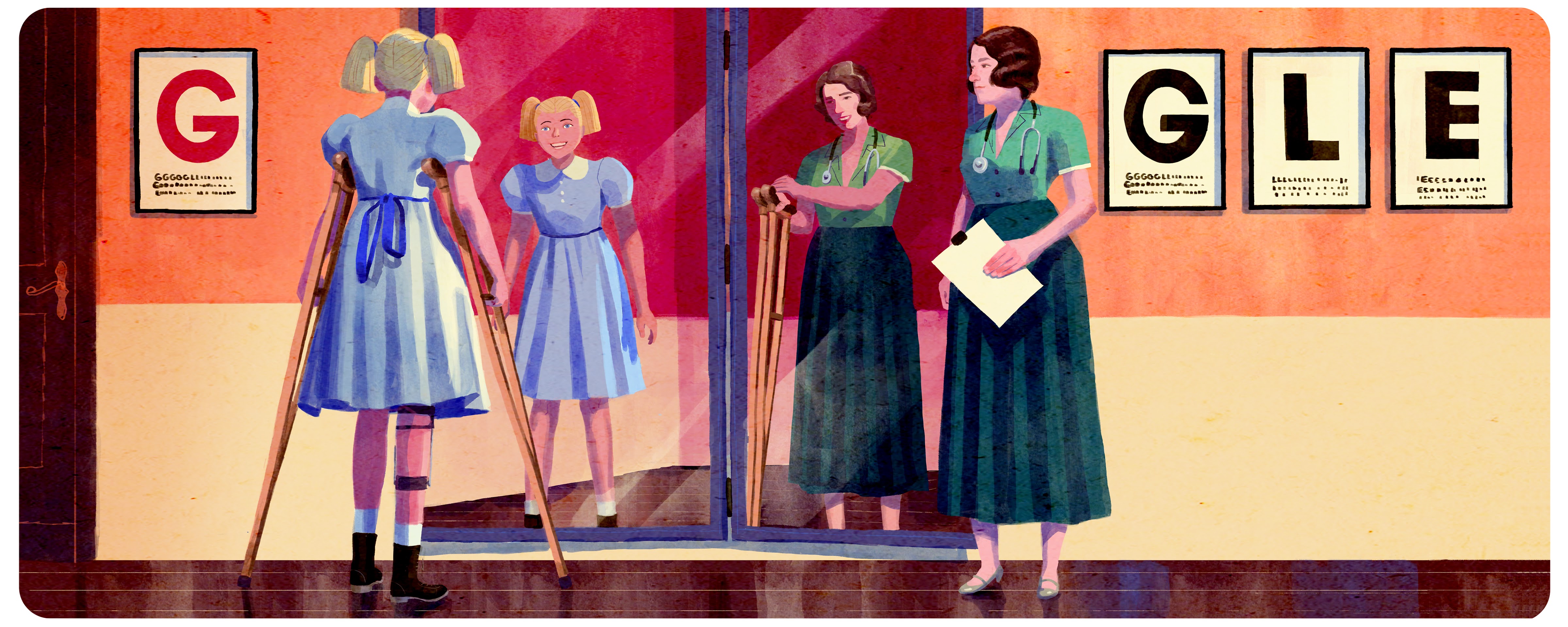
Judy Heumann, a disability rights activist, provided thoughtful feedback on a Google Doodle celebrating the polio vaccine work of Dame Jean Macnamara: “...it is unfortunate that the rendering of her work has a child who is wearing braces and using crutches looking at herself without her braces or crutches. Post-polio survivors have fought for decades for people to see us with our braces, crutches, wheelchairs, and ventilators and value us for who we are. These pieces of technology have enabled us to fight for our rights as disabled people, winning victories such as the signing of the 504 regulations, the passage of the ADA, and the adoption of the UN Convention on the Rights of People with Disabilities.”
Appearance
Do
Show a variety of disabilities and use a range of ways to tell that story beyond wheelchairs – hearing aids, walkers, etc.
If you are going to show a wheelchair, show a customized power chair rather than defaulting to a generic hospital wheelchair.
Create portrayals that break the stereotype of a low quality of life.
Other sources: Disability Museum, “Stereotypes about People with Disabilities;” “Media Smarts, Common Portrayals of Persons with Disabilities”
Case studies
Ensure intersectional representation in storytelling
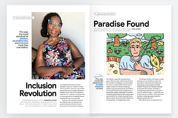
In 2020, Google created a print magazine, in partnership with Pop Up Magazine, for the Year in Search campaign. This prominently featured disabled people, such as Andraéa LaVant, and Ross Minor. Explore a digital version of the magazine.
Represent disabled people in creative teams

Disabled creatives were involved and supported as crucial contributors in the production of Forward Rhythm, the story of Jason Barnes, a disabled drummer. This includes working with photographer Justin Kaneps, and licensing music and images from Jason and his family wherever possible. Consider hiring people with disabilities within your team to build an inclusive team, and therefore create accessible work. When planning for shoots make sure you plan enough time and budget to include the right people. Find out more about the Forward Rhythm story.
Make cultural moments more accessible
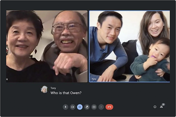
Google’s first-ever broadcast spot on accessibility features Googler and CODA, Tony Lee. The acronym CODA stands for ‘Child of Deaf Adults,’ and is a term used in the Deaf community for children of deaf adults who are hearing. The film not only elevates a not-often-known disability community, it was also launched during the 2021 Oscars. This year for the first time captions and audio descriptions were provided for The Oscars live show, supported by ABC and Google. Watch the CODA campaign.
Include accessible user experience as a core project goal

Google’s Belonging site prioritized accessibility from the beginning and throughout the project. By conducting accessibility design reviews, working with writers on inclusive language, doing extensive accessibility QA testing and getting feedback directly from people with disabilities, the team worked to build disability inclusion into every aspect of the site experience. Check out the Belonging site.
Ensure film assets include captions

As part of the launch of the Belonging site, Google shared the story of Dimitri Kanevsky. Dimitri is a speech research scientist working to help people fully participate in the conversations around them, with technologies like Live Transcribe. This short video included burned in captioning, designed in the most accessible way considering text placement, and color contrast ratios. Watch Dimitri’s story.
Social media
Social media follows the same principles as web accessibility
Some initial considerations when creating accessible content on social media: